Redesigning home search for millions
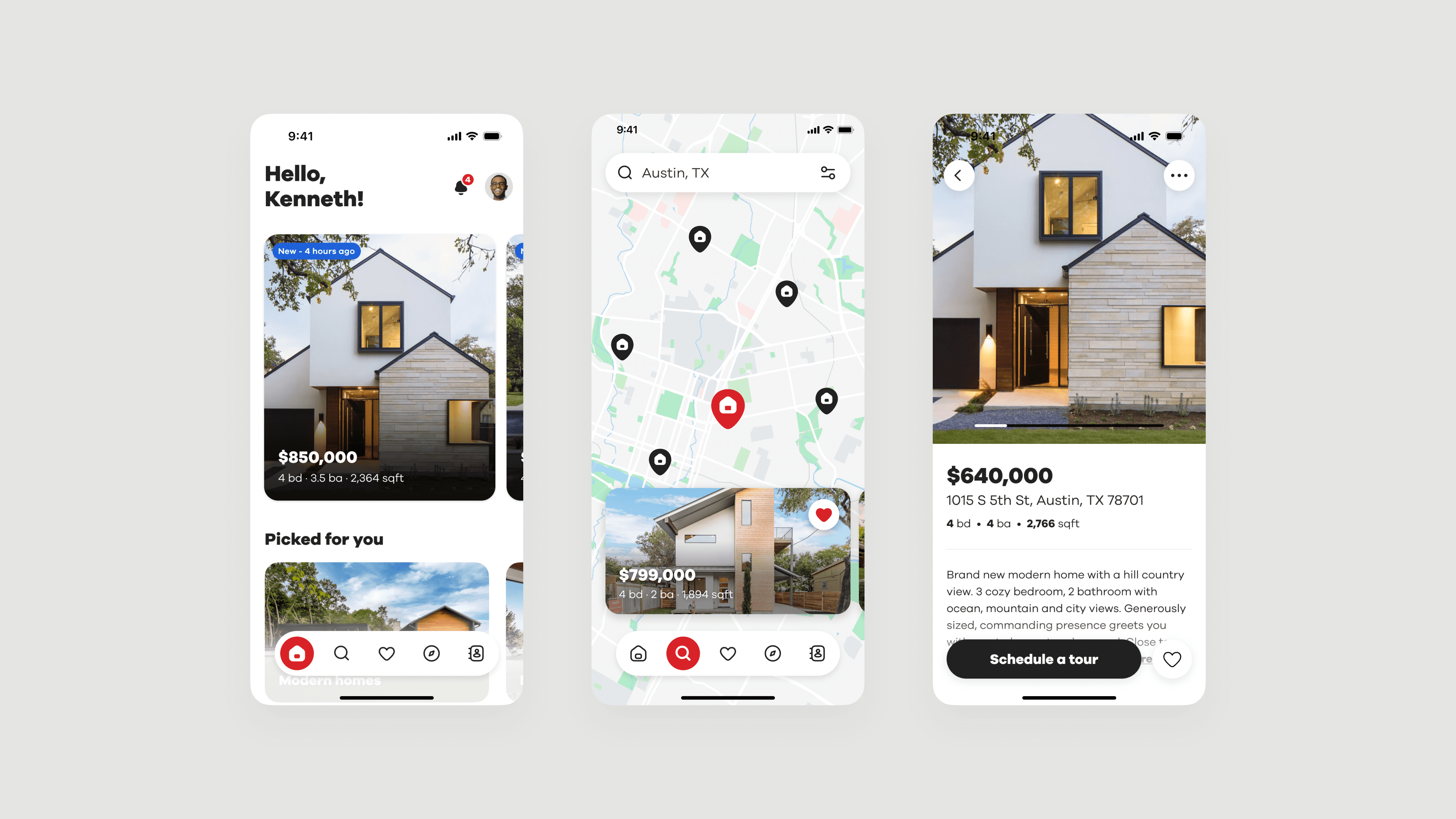
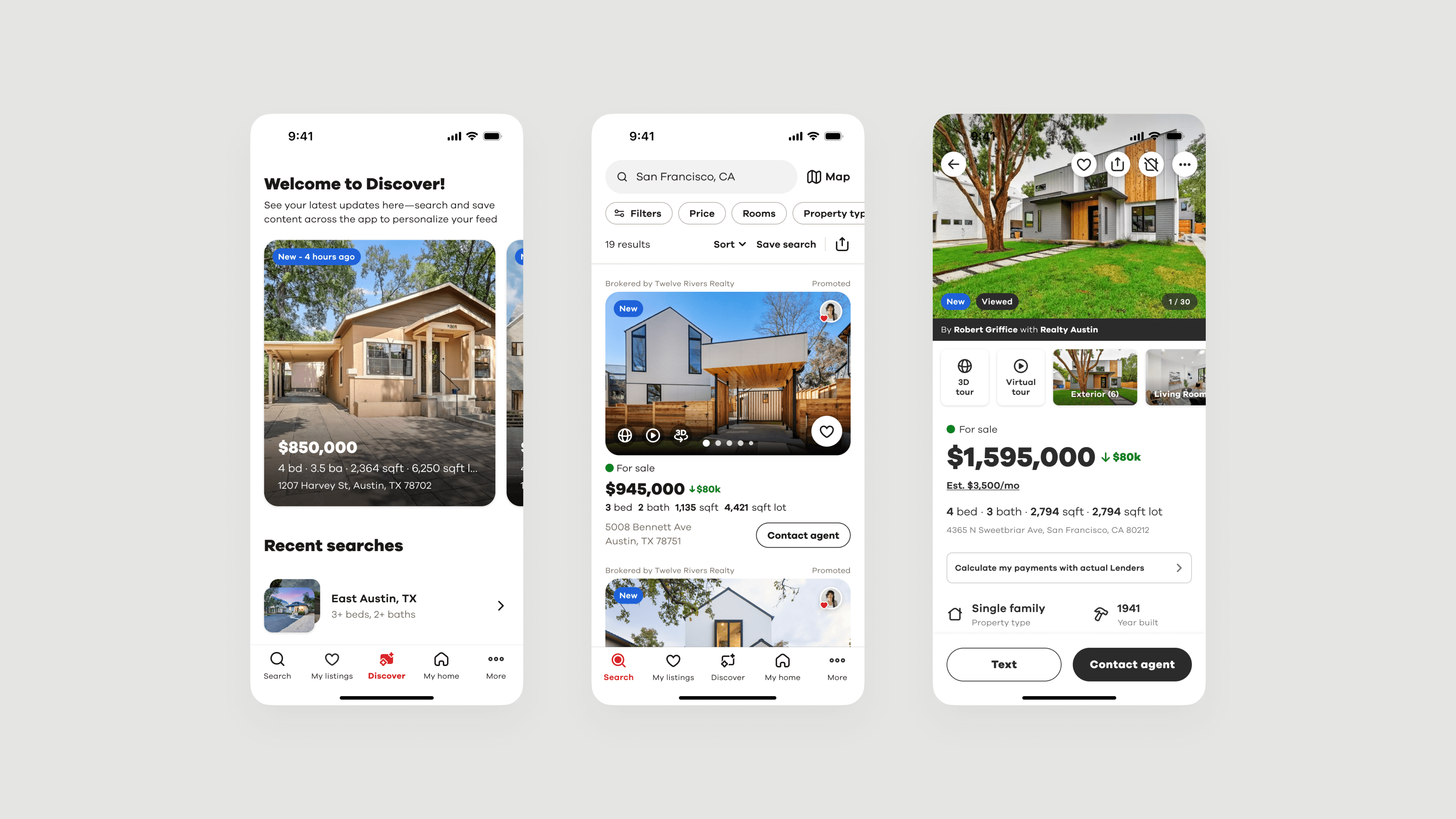
Realtor.com's mobile app was functional but forgettable in a crowded market of similar experiences. I led the first complete redesign in a decade, rebuilding the iOS and Android apps from the ground up with a new visual language, comprehensive design system, and reimagined user experience. I designed and shipped 50+ screens to 7.5 million users. Three months after launch, the redesigned apps drove 16% user growth, a 4.4% revenue lift, and a 23% drop in bounce rate.
Company
Realtor.com
Year
2023
Role
Lead Product Designer
Timeline
6 months
01 CHALLENGE
Realtor.com had 7.5 million mobile users. Competitors grew faster and felt more modern. The app worked, but it didn't stand for anything. It met business goals, but it didn't give people a reason to choose us over Zillow or Redfin.
Leadership knew this. They launched the Native as #1 initiative to make the mobile app the flagship experience. The bet was simple: if we could create an app people actually loved using, it would pay off in growth and loyalty.
The problem wasn't a lack of features. It was that the interface felt generic, cluttered, and flat. The product looked like a collection of tools instead of a brand that understood what it feels like to search for a home.
My role was to lead the complete redesign of both iOS and Android apps—from initial vision and research through design system creation to final shipped product.
Core issues:
Functional but bland interface in a market full of similar apps
Outdated visual language that felt more like spreadsheets than a home search
Redundant flows that added friction, especially for serious buyers
Inconsistent patterns across iOS and Android
No clear emotional story to differentiate Realtor.com
02 RESEARCH
Understanding what first-time buyers need
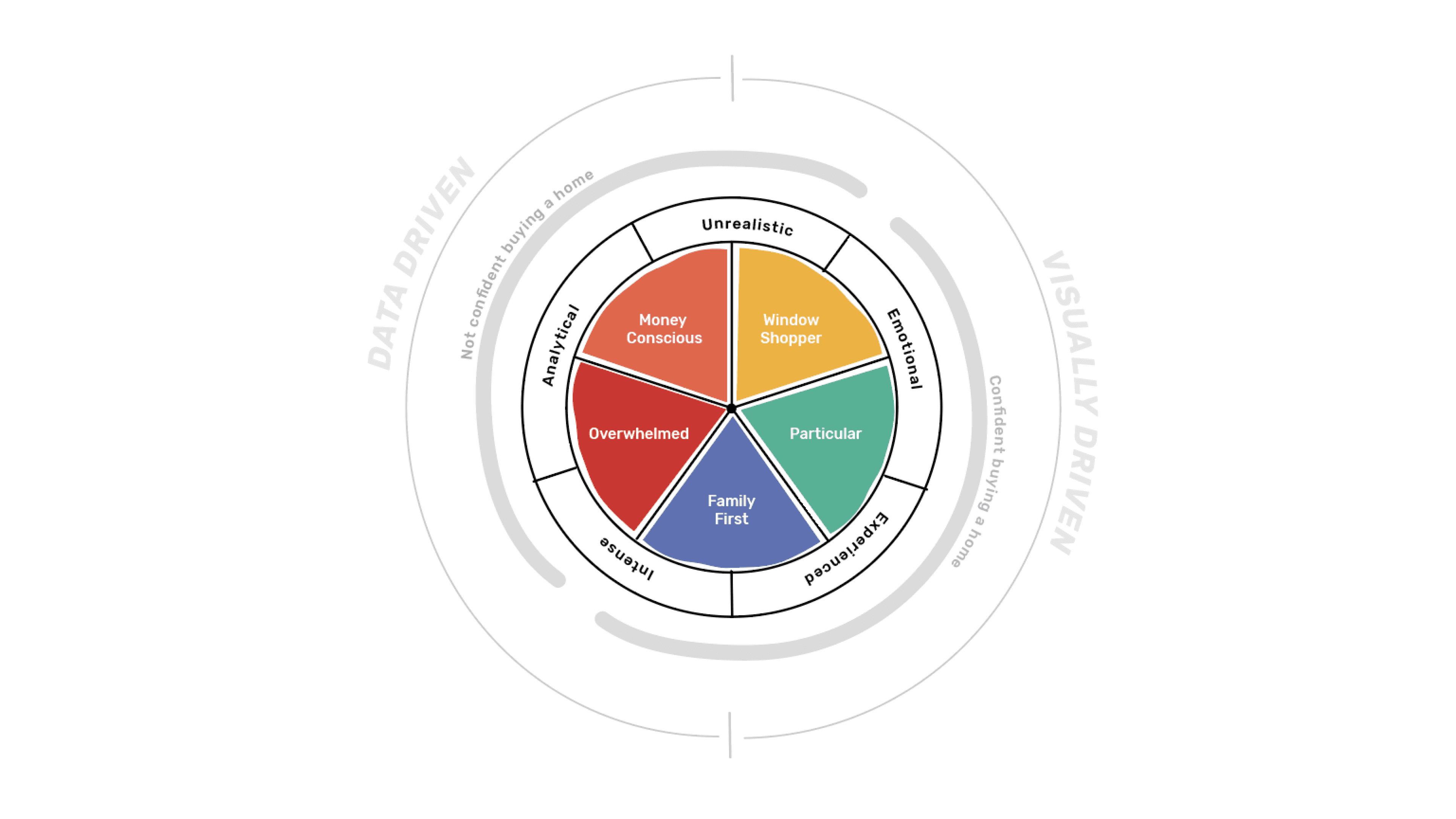
I focused on first-time homebuyers. They represented a large share of our audience, and 86% of them were under 38. That was more than a demographic insight. It was a strategic opportunity. If we could make the experience feel approachable for them, it would lift the experience for everyone.
Competitive landscape
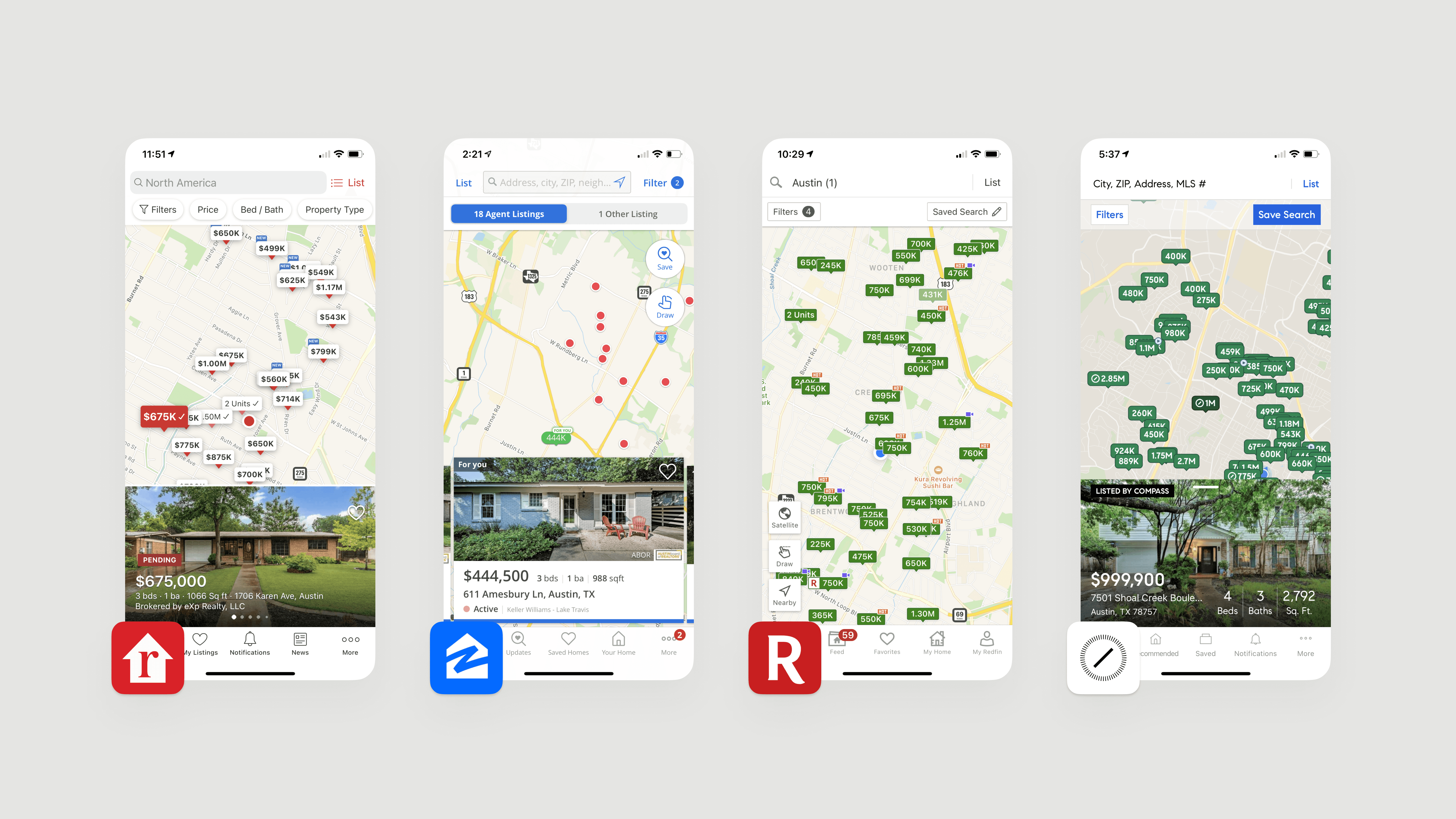
I ran competitive analysis against players like Zillow and Redfin and looked at adjacent experiences where people make high-stakes decisions on mobile. Competitors leaned into bold visuals, strong photography, and a sense of personality. Realtor.com felt safe and utilitarian. It delivered listings, but not much feeling.
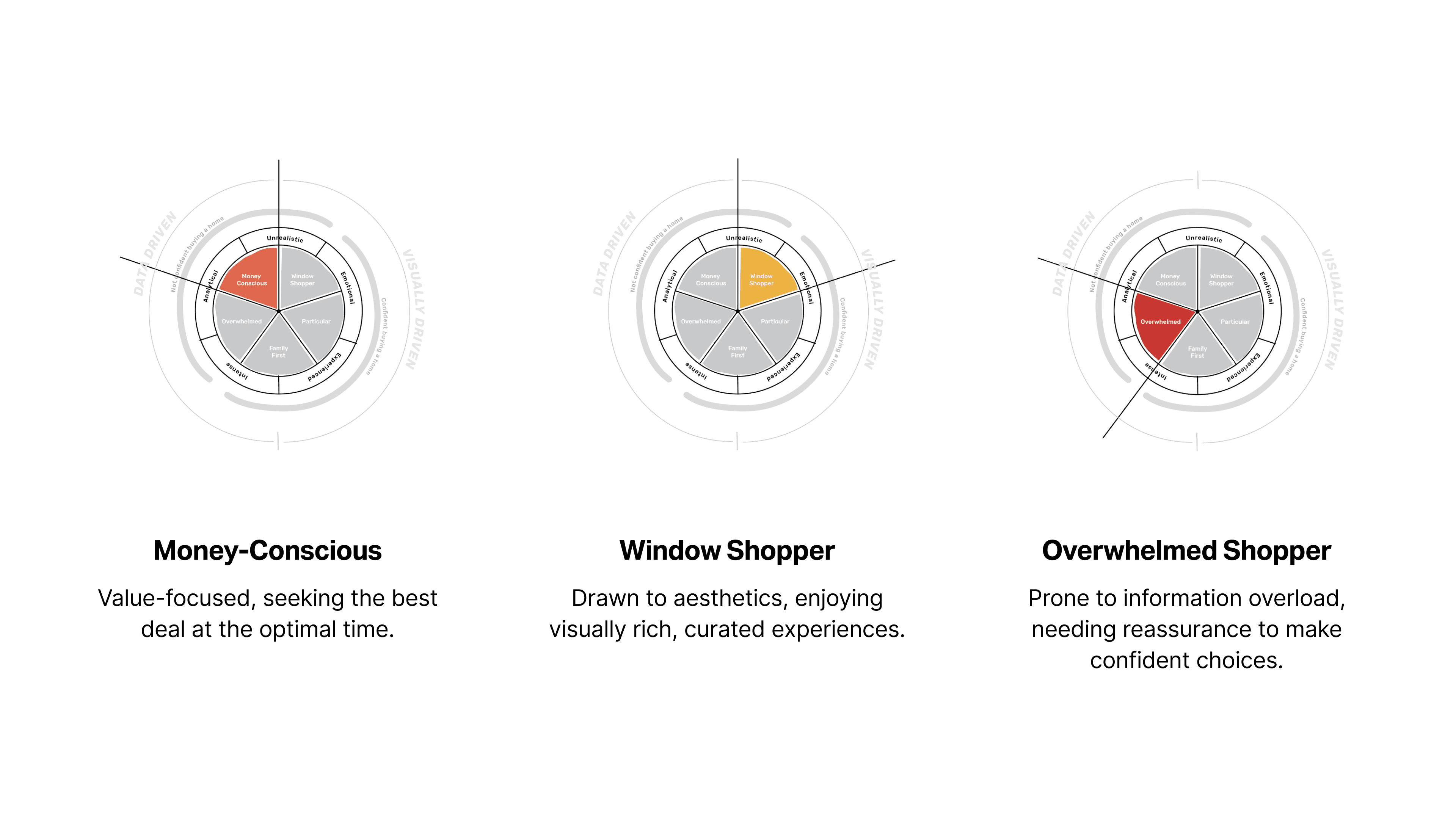
Behavioral archetypes
Research revealed five distinct user types. Window Shoppers wanted rich imagery. Particular buyers needed data and control. Family First users prioritized schools. Overwhelmed buyers needed validation. Money Conscious buyers wanted value signals.
Each archetype had different emotional needs and different moments when they needed reassurance, guidance, or clarity. A one-size-fits-all experience wouldn't work. The app needed to flex for different types of buyers without turning into a maze of settings.
Key findings:
First-time buyers needed emotional reassurance as much as factual information
Comparison and decision moments were the highest friction points
Saved homes and shortlists were hard to manage and revisit
Competitors led with personality and confidence, while we felt flat
03 SOLUTION
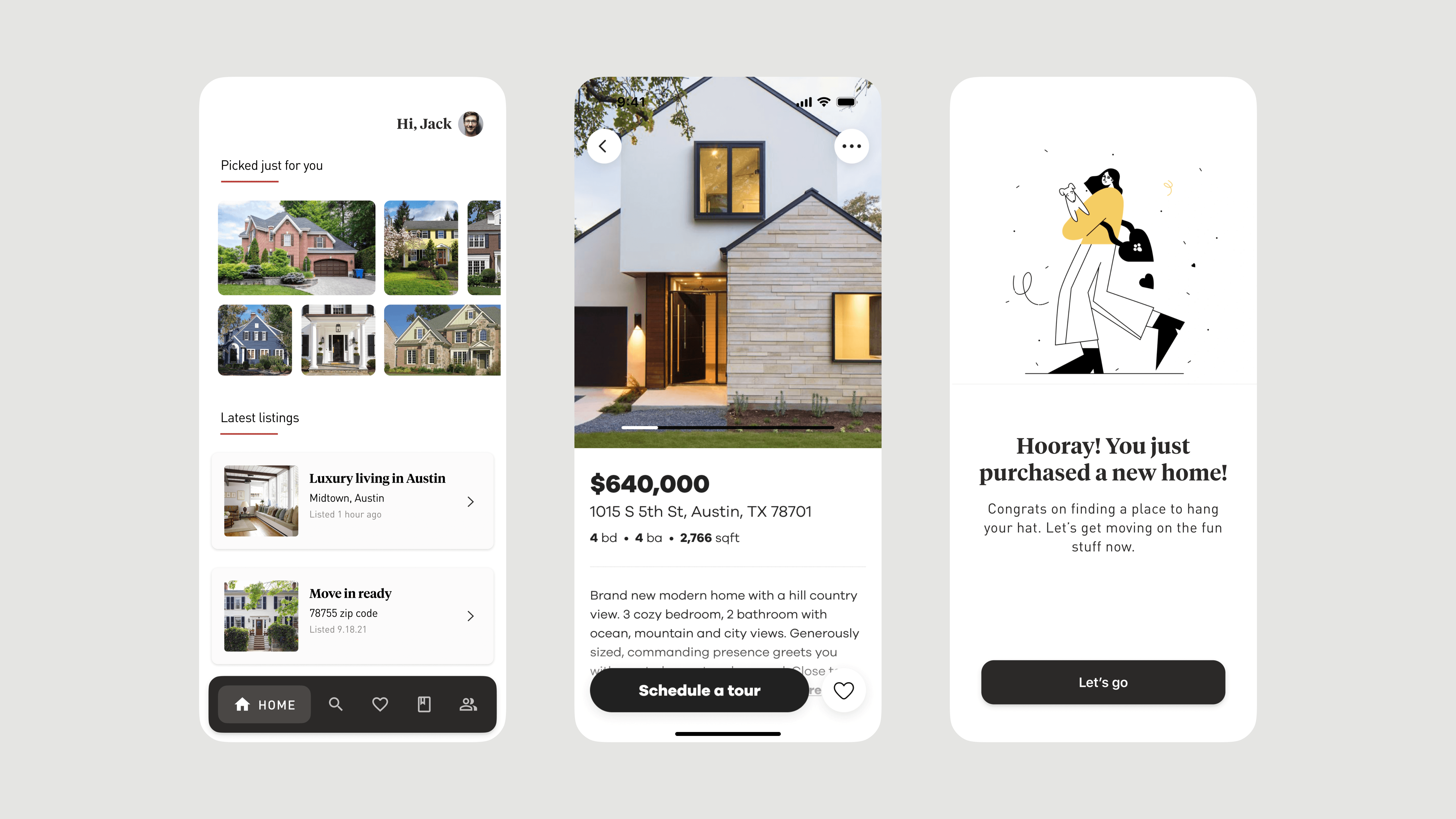
Rebuilding the app from the ground up
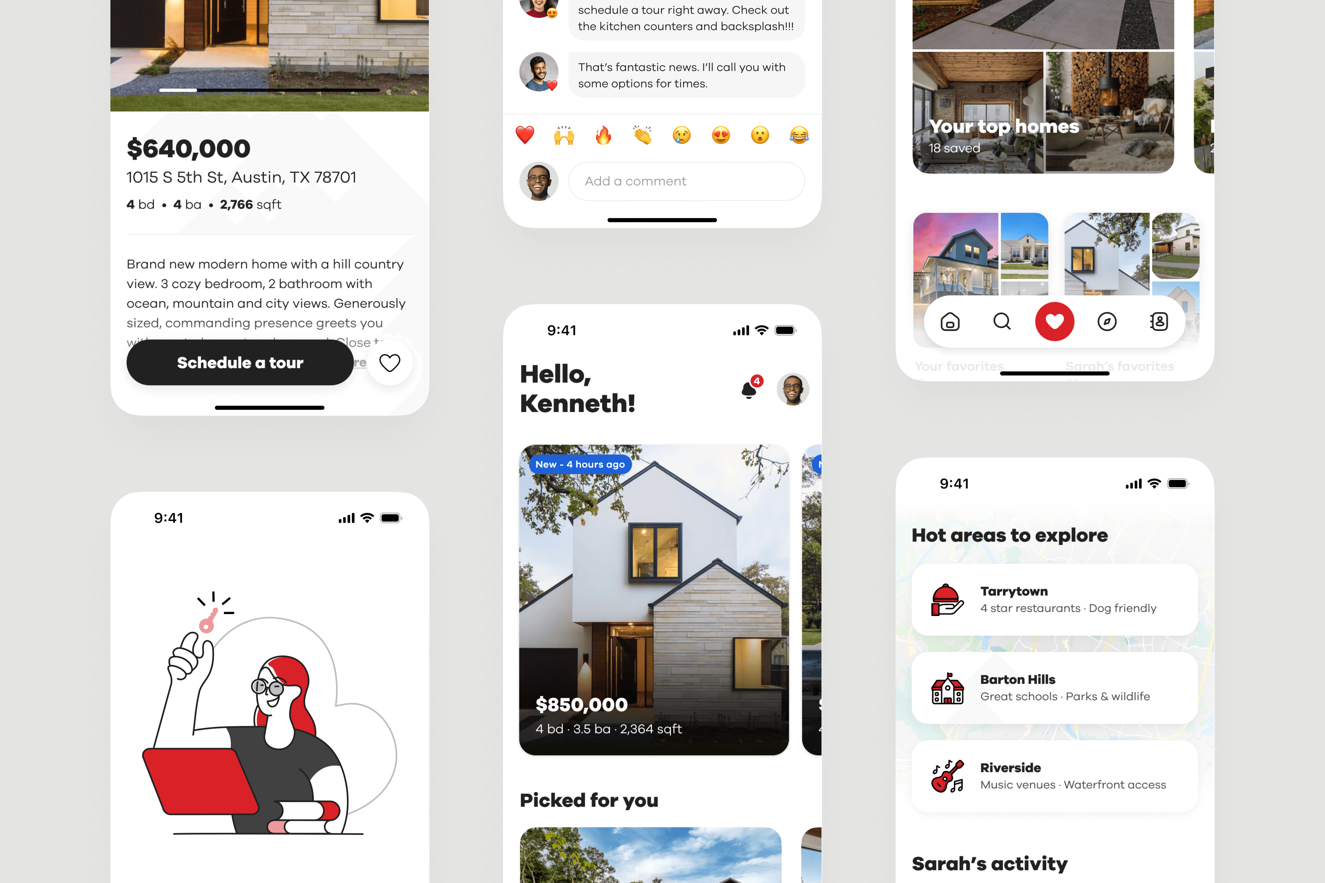
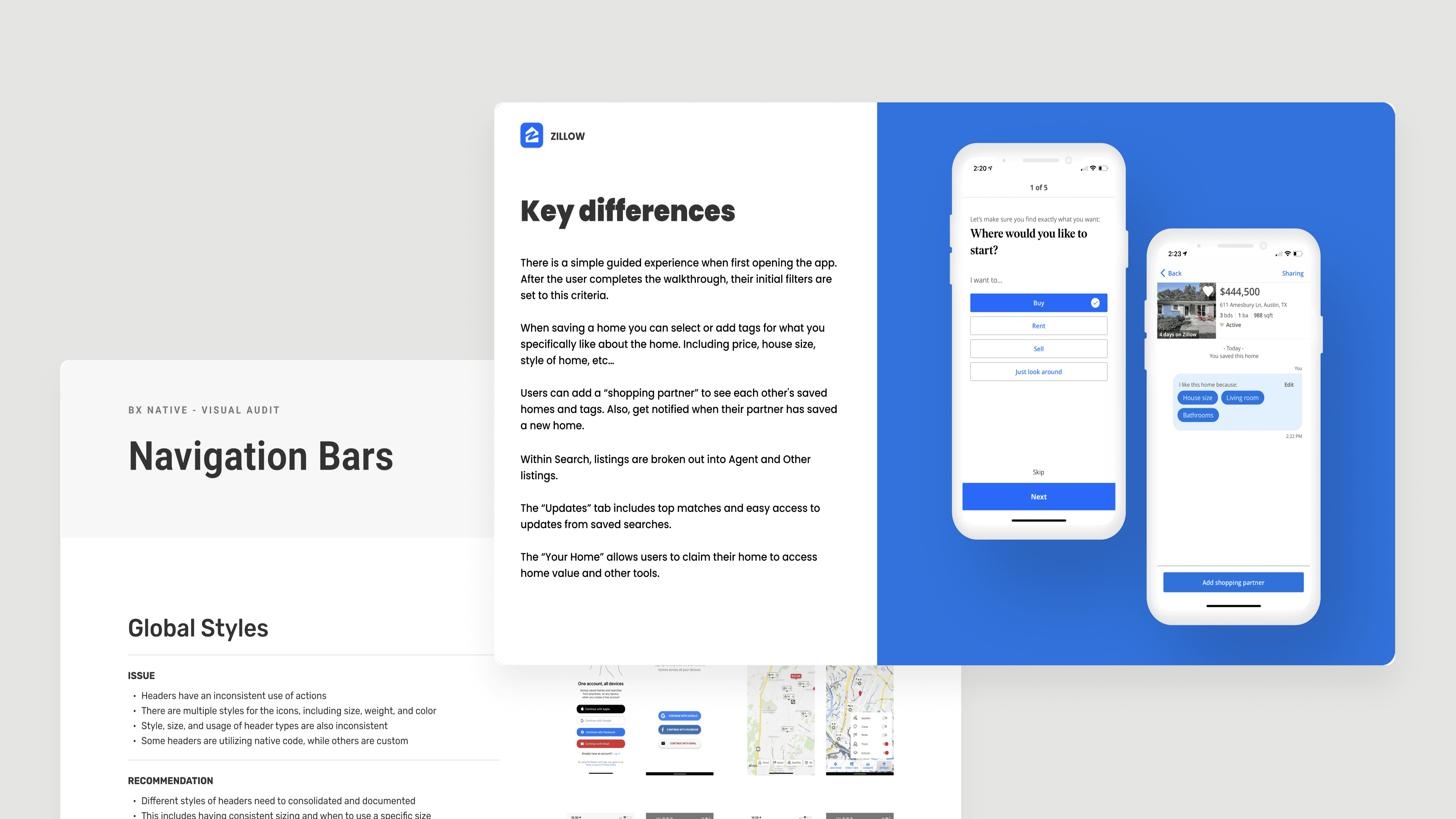
The objective was clear: completely redesign the iOS and Android apps to create a world-class mobile experience that felt confident, youthful, and enjoyable. This wasn't about adding features to the existing experience. It was about rebuilding the entire product with a new visual language, interaction patterns, and design system—then shipping it to millions of users.
Before designing any interfaces, I led the work to define a North Star that showed where the product was headed and built organizational alignment around the same future. This vision became the blueprint for the complete redesign that followed.
Moodboards and style tiles
I created emotion-driven design directions for each archetype. Window Shoppers got vibrant imagery and editorial layouts. Particular buyers got balanced data. Family First got functionality-first designs. We tested with users and synthesized the strongest elements into one unified direction.
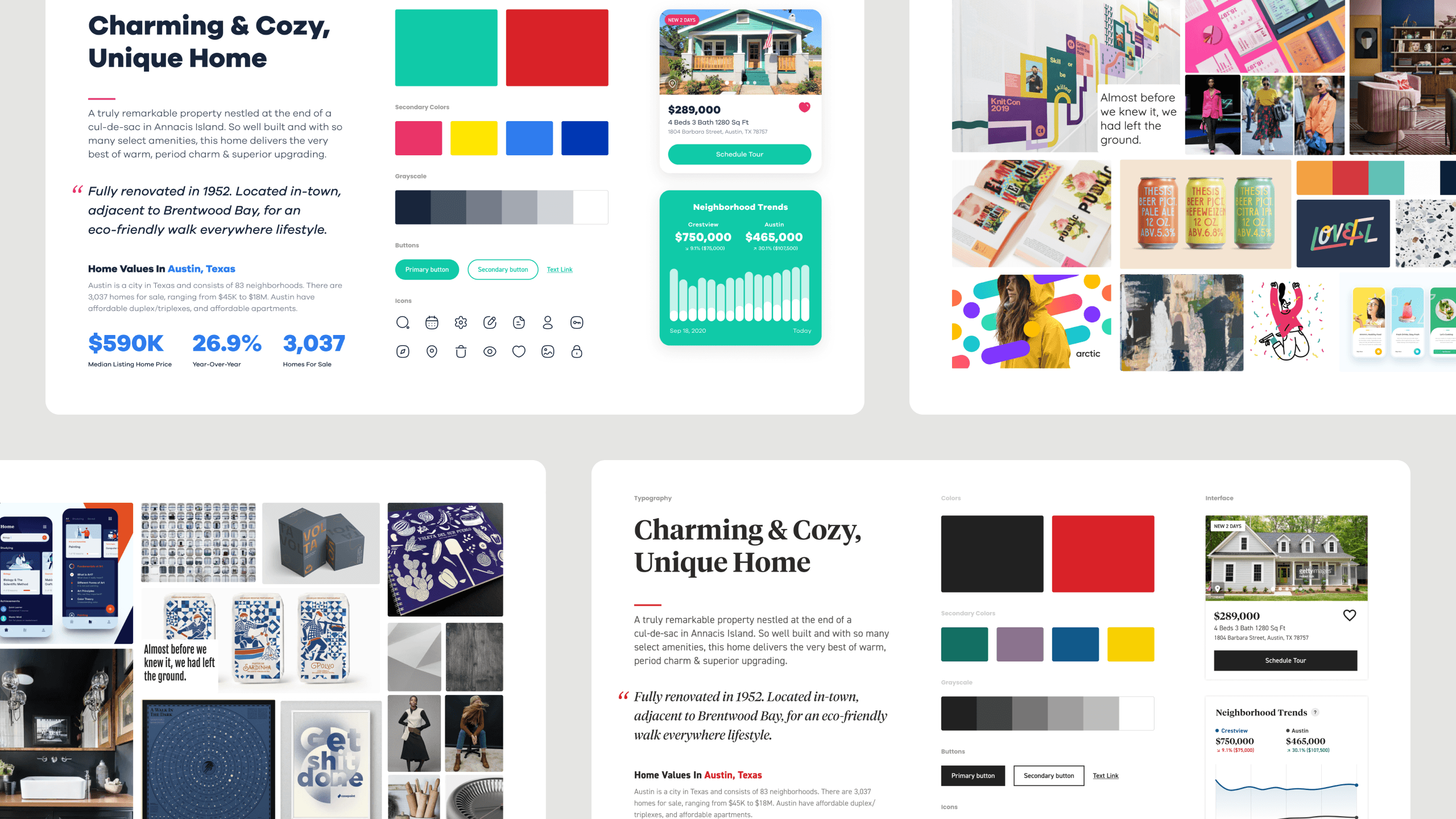
Persona-driven experiences
Each archetype informed unique aesthetics and functionality. The designs weren't just prettier—they aligned to what each user type needed emotionally at critical moments.
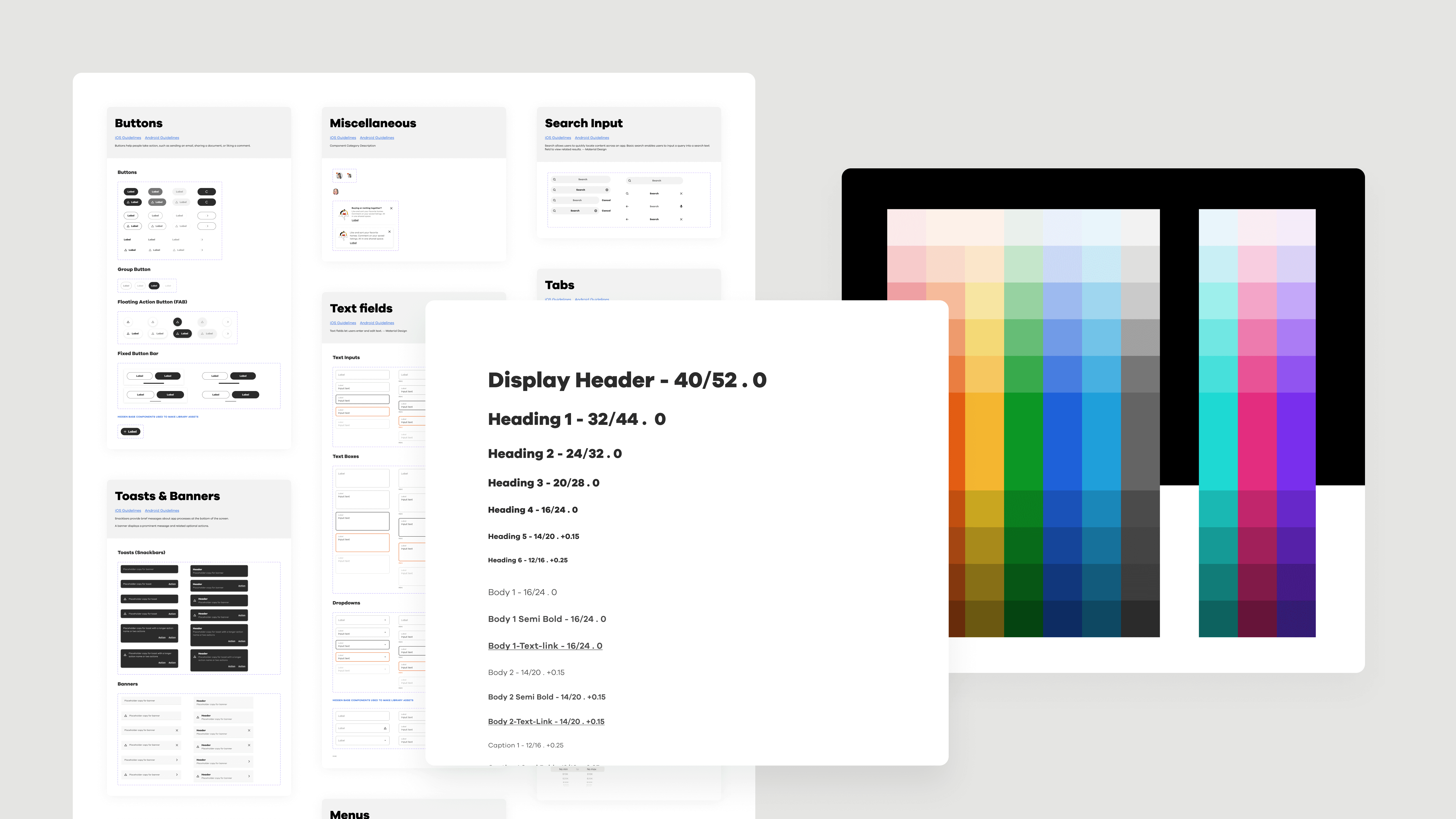
A comprehensive design system
I built Realtor.com's first native design system. Refined type scale using Space Grotesk and Inter. Expanded color palette with accessibility built in. Custom icon library. 16px baseline grids. Design tokens for iOS and Android. A centralized Figma library that made the brand scalable.
04 impact
From vision to shipped product
The redesigned apps launched through internal beta, external testing, then gradual A/B rollout. Three months later, results were clear.
The North Star Vision became more than a prototype—it became the blueprint. The visual language and design system scaled to the website, marketing channels, and every new feature. We created a cohesive brand experience that finally felt distinctive.
The design system enabled faster iteration and consistent quality across teams. More importantly, it gave the organization shared understanding of where we were headed. Product, engineering, and marketing all pointed to the same future.
05 REFLECTION
Build consensus through action
Biggest lesson: transforming established products requires more than design skills. You need to build consensus, manage technical constraints, and coordinate teams that have never worked together.
The breakthrough came from showing, not telling. Prototypes demonstrated value faster than roadmaps. Data created urgency that strategy decks never could. I learned to move fast while bringing people along and to measure success in user behavior and business results, not just shipped features.